


Back in 2020/21, the Nigerian Government banned the use of Twitter (now X).
I lived in Nigeria and enjoyed using Twitter back then.
I couldn’t let go of the great conversations, so I downloaded a VPN, Windscribe, to help me access it.
Today, that ban has been lifted, I don’t use Twitter as much, and I use a VPN even less so.
Naturally, Windscribe did what any self-respecting SaaS company would do and sent me a re-engagement email.
And as an email enthusiast, I decided to review it for this week’s email audit.
As usual, there are the Goodies (this email has a lot of those) and the Uglies.
Let’s get into it:
If you’d rather read instead of watch, here is a text version for you:
Goodies
1, Don’t be afraid of a little quirky
In this email, the quirky and interactive subject line takes the WIN.
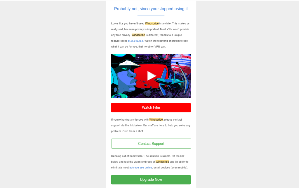
The subject line of this re-engagement email is: “Did you know Windscribe can do this?” And the first line of the email says: “Probably not, since you stopped using it.”
And it’s great because it is witty. It makes you laugh and since people will always remember you made them feel, a little spark of joy is good work.
It also makes subscribers want to keep reading since they feel called out but in a nice way.
So if whimsical, quirky, or funny works for your brand, this is an idea you definitely want to try out.
Do you need to spot and plug money-leaking, client-shedding holes in your email marketing funnel without the anxiety brought on by guesswork? I can help. Let’s talk!
2, Pique their interest
The subject line and first line of the email grab the reader’s attention, the rest of the email whets their appetite.
It highlights WHY they should be using the app. In this case, it is an extra layer of protection that isn’t provided by any other VPN user.
The email employs the Unique Selling Point of the app, by stating how they are different from other providers of the same service. It even calls it “true privacy” And this naturally leads to the video which the reader is encouraged to watch.
3, Nice use of Buttons
A bright red button with a clear CTA can turn any email around but it is right at home here. It clearly indicates the action the reader should take next.
Last week’s email wasn’t so great because it didn’t have any buttons.
But now we get to see a brand take buttons seriously, especially in a re-engagement email and I love it for them ngl.
Uglies
1, No connection to the app.
The main reason you send a re-engagement email is to get the user to use the app again.
And the one button that wasn’t here was ‘Use App’.
It’s such a missed opportunity because the user doesn’t get the option to go back to the app.
And at the risk of being a know-it-all, if I’m not using an app, I won’t need to contact support, and I definitely won’t pay for the service.
It’d be better to divide the email into a drip of two emails.
The first makes them understand why the app is special.
After a clickthrough to the app has been confirmed, it triggers the second email that offers support and convinces the user to pay for the service because of limitations they might have experienced while using the app or to take full advantage of all the benefits of R.O.B.E.R.T.
2, Remember to test.
A fail-safe way to know which emails would be most effective for the company’s ultimate goal would be to test.
Test the drip against the blast and see which one works better.
If you need help auditing your emails to fix the money-leaking holes in your sequence, reach out.
Do you need to spot and plug money-leaking, client-shedding holes in your email marketing funnel without the anxiety brought on by guesswork? I can help. Let’s talk!

0 Comments